UX Case Study
How research, hard-won credibility, and a three-field sign-up form helped one of India's first discount brokers convert visitors into traders.
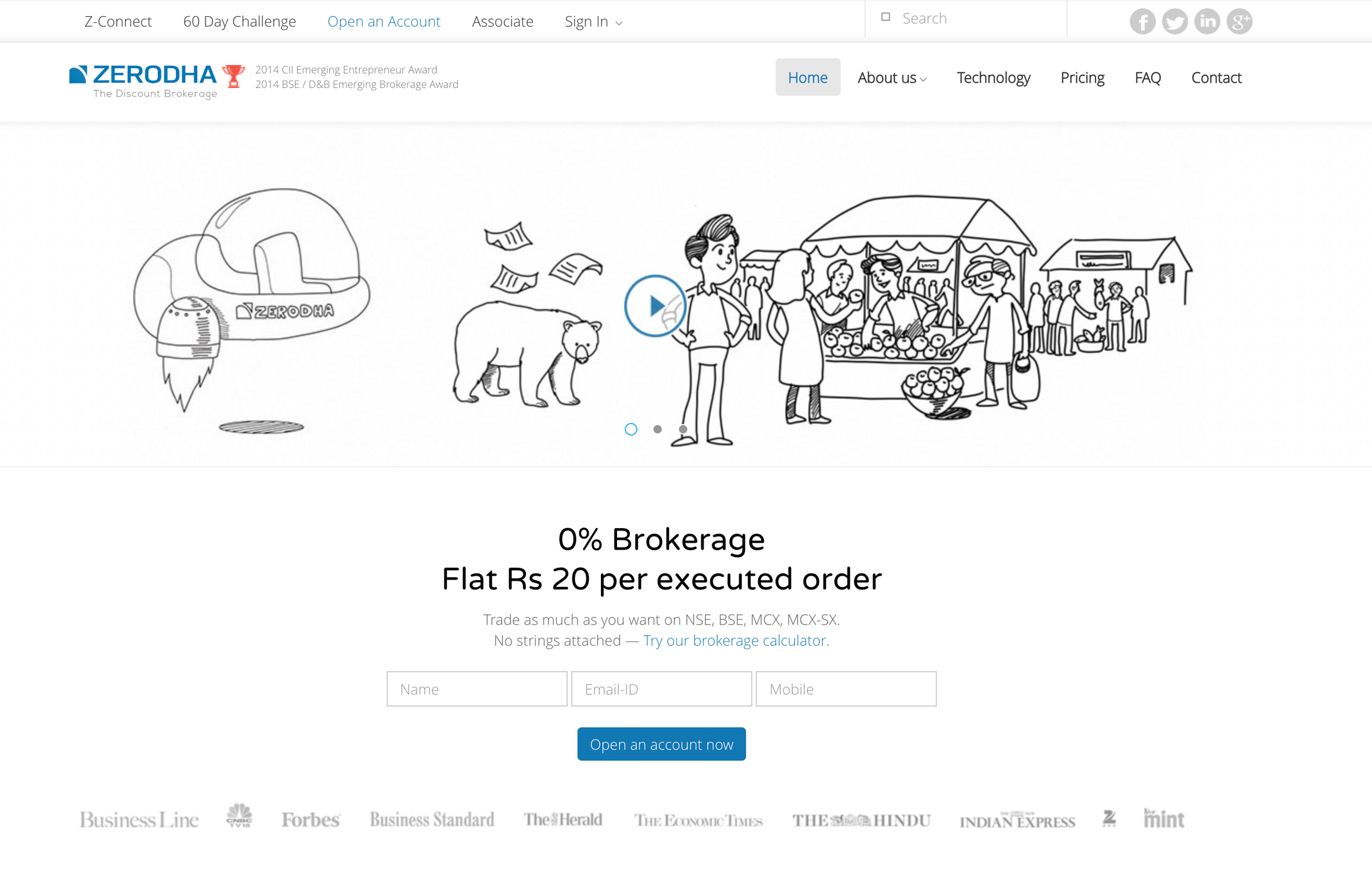
Zerodha had powerful SEO pulling visitors in and a website that lost 95% of them before they signed up. Leading the research and redesign for Domy, we rebuilt trust with a real-time testimonial face-pile, fixed the information architecture so people could actually find things, and stripped the account-opening form down to three fields. Opening an account went from a chore to under ten minutes and lead conversion climbed sharply.
Zerodha is an award-winning Indian financial services company offering retail and institutional broking, distribution, and currency and commodity trading. It was India's first discount brokerage, offering the lowest brokerage rates in the industry over 3.5 lakh trading customers and roughly 5% of daily retail trading volume across NSE, BSE, and MCX, which is enormous for the Indian market.
I led UX for the website redesign at Domy. The product was strong; the website wasn't doing it justice.
SEO was doing its job visitors were arriving in large numbers. But the site was hemorrhaging them: 95% of users left before signing up. The traffic was there; the conversion wasn't. The brief was direct: turn visitors into account holders.
I started with stakeholder interviews across the CEO, CTO, CFO, and the marketing team. These gave us a clear picture of the user segments, the business objectives the design needed to support, and the technical constraints we had to design within the foundation for everything that followed.
We ran an extensive competitor analysis across both direct rivals and indirect competitors, auditing information structure, layout, tone of voice, and navigation mapping what users in this category already expected.

We interviewed users drawn from the segments the stakeholders identified, focusing on what they expected from the breadth, depth, and organisation of the content and whether they had any existing understanding of Zerodha.

"Need an easy-to-use website. I wanted to invest money, so I need the most trusted share-trading company."

"I don't know anything about stock trading, but I've heard you can earn a lot. I want to learn and need help getting started on mobile."

"Need to calculate the brokerage fee, and know about new products and trading news. Quick and mobile-friendly."
Three themes explained the drop-off:
We synthesised the user, task, and environmental profiles into a primary persona that kept the team aligned on who we were really designing for.

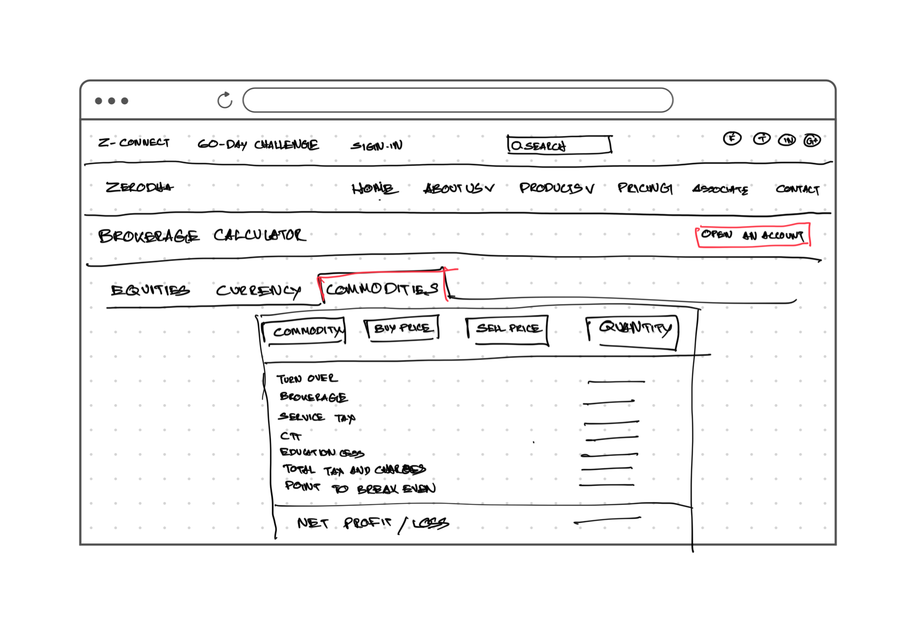
We built the information architecture and low-fidelity concepts for the primary use cases, then ran usability tests once stakeholders signed off. After a couple of rounds of iteration on the test results, we had the confidence to move to high-fidelity wireframes including a brokerage calculator that answered a recurring user need.
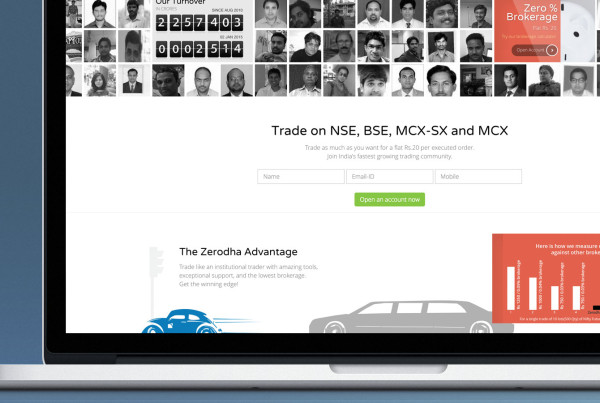
To build credibility, we created a platform to collect feedback from existing customers. We expected a trickle; we got hundreds of genuine reviews and almost everyone agreed to be published with their photo. A standard testimonial block felt flat, so we built a real-time, dynamically generated face-pile at the top of the page. No repeated faces: every visit greets users with fresh people and fresh testimonials.
Market surveys, conversations with active traders, and sessions with industry leaders kept pointing to the same culprit: overwhelming account-opening questionnaires. Attention spans were collapsing, and nobody wanted to fill out long forms online or offline. The form needed prominent placement, minimal input, and maximum autofill so the system did the heavy lifting.
We redesigned it down to three fields and placed it at the very top of the page. Anyone could sign up in under ten minutes, and Zerodha would follow up. That single change transformed lead conversion and the results were outstanding.
Trust is a design problem. In a category this young, credibility couldn't be claimed it had to be designed in. Real faces and real reviews did more for conversion than any amount of persuasive copy.
Remove friction at the moment of intent. The three-field form proved the point: reducing what we asked for, rather than adding more persuasion, was what actually moved the needle.
Research turns opinion into direction. Stakeholder and user interviews kept the team anchored on the real problems findability and trust instead of debating surface aesthetics.
Archer's dashboard redesigned with responsive layouts, cleaner UI, and smarter interactions, simplifying complex risk data.
Read the Case studyA mobile app that studies movie-lovers their likes and dislikes and recommends the films they're very likely to love, free of fake and paid reviews.
Read the case study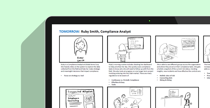
Deep stakeholder, expert, and customer research that produced five behavioural personas and a Today-vs-Tomorrow vision to align the business.
Read the case study