Designing online stock trading website
Playing a part in the success story of one of the first discount brokers in India

Playing a part in the success story of one of the first discount brokers in India

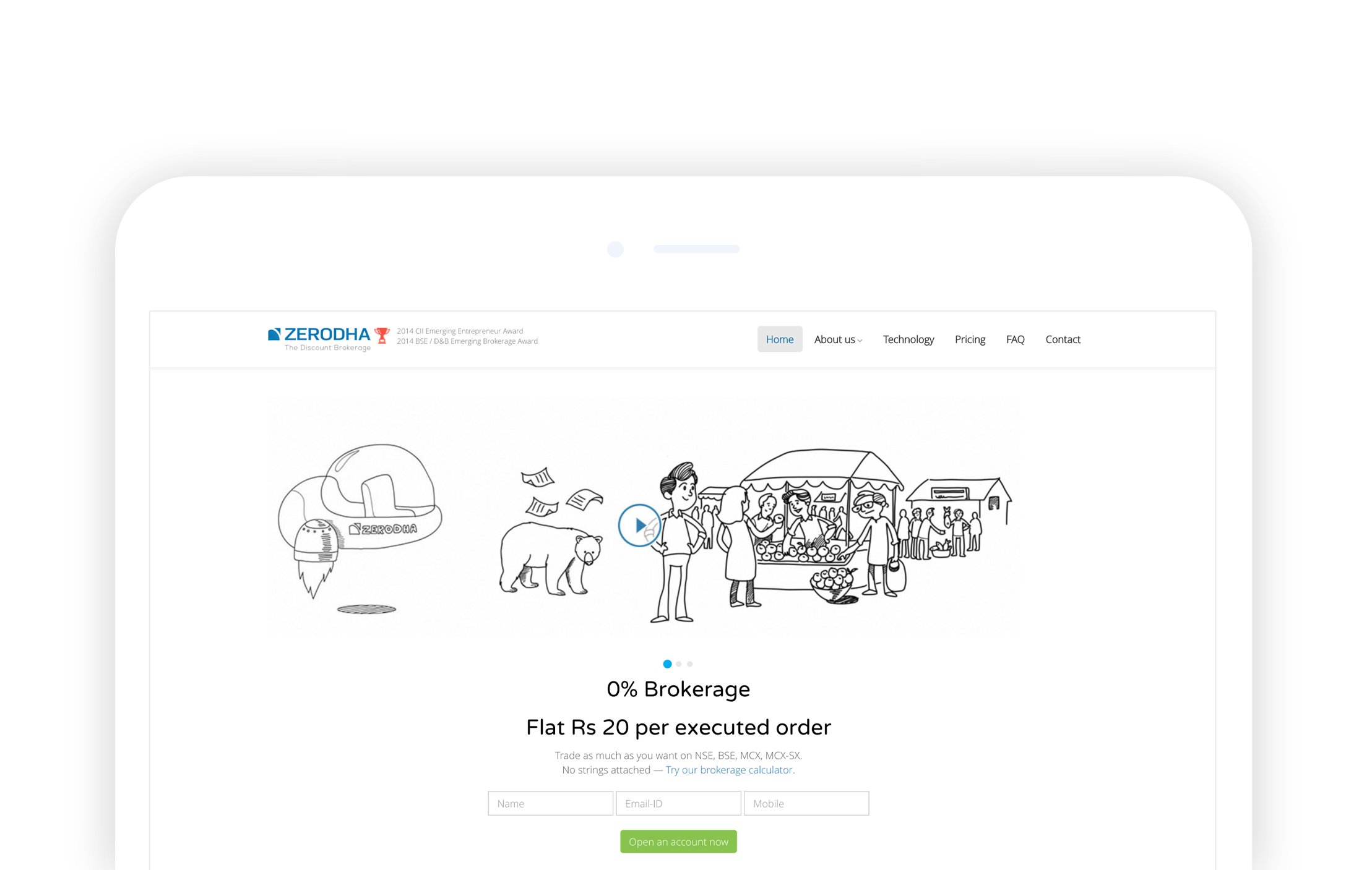
Zerodha is an award winning Indian financial services company that offers retail and institutional broking and distribution, and currencies and commodities trading.
Zerodha is India's first discount brokerage offering the lowest brokerage rates in the industry. They have over 3.5 lakh trading customers. They do 5% of daily retail trading volumes across NSE, BSE, and MCX. (Which is massive, if you know about the Indian financial market.)
Design Strategy UX Research UI Interaction Design
The Zerodha platform was struggling with a large amount of bounce rate. Even though SEO played a vital role in bringing leads to the website, the number of people leaving was huge. 95% of the users leave the website before signing up with Zerodha.
Bridging Business Goals with User Goals
We conducted interviews with various stakeholders of Zerodha, including the CEO, CTO, CFO, and the marketing team. These interviews helped us to get a clear picture of the User segments , the Business goals ( How will the design support business objectives? ), the Technical limitations ( What technical obstacles need to be overcome? ) and get to kick-start the design process.

An extensive competitor analysis was conducted with both organisations directly related to Zerodha's business model as well as indirect competitors, we audited information structure, layout, tone and navigation.
To better understand the Zerodha ecosystem and determine whether users already had an existing understanding of Zerodha, we talked to around 4 potential users from the user segments we got from the Stakeholders. Our primary focus was to understand the user's expectations about the breadth and depth of content and the expected content organization.

" Need an easy to use website. I wanted to invest money, so need a most trusted share-trading company"
- Working professional

" I don't know anything about stock trading but I've heard we can earn a lot. I want to know more about trading and need help in getting started. I wanted to access it on mobile."
- Home Maker
Key Findings from the Research
Synthesised the information from User profiles, Task profiles and Environmental profiles
We started creating the information architecture and low-fidelity concepts for primary use cases. We conducted usability tests with the low-fidelity mockups after having a go-ahead from the stakeholders on the mockups. After a couple of iterations based on test results, we got confidence in the designs and started creating high-fidelity wireframes.
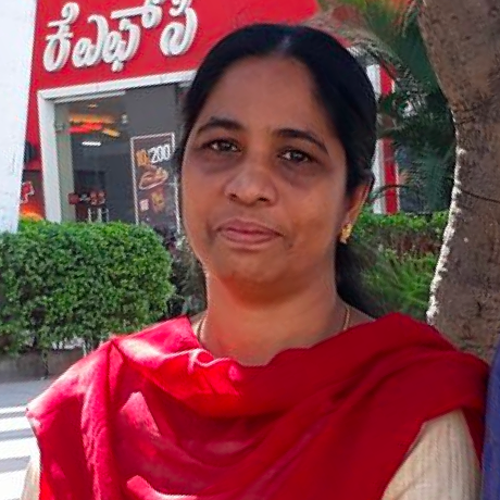
We created a platform to collect feedback from the company's existing customers. The team reached out to the clients and requested them to share a genuine review about their broker. Surprisingly to us (and not to the people at Zerodha), we got hundreds of responses, and the feedback was extraordinary. Also, almost every customer permitted us to publish their reviews with their pictures.There was nothing new to add a typical testimonial on the homepage; nothing aesthetically excellent too.

However, we all knew that we somehow wanted to highlight these feedback comments on the top of the website! Finally, the idea of a face-pile came up.we faced another challenge of picking the best reviews from the big pile. We solved it by making the face-pile real-time and dynamically built. So, you will not see the same guy and his feedback repeatedly. Instead, the users will be greeted with fresh faces and testimonials every time they visit the website.